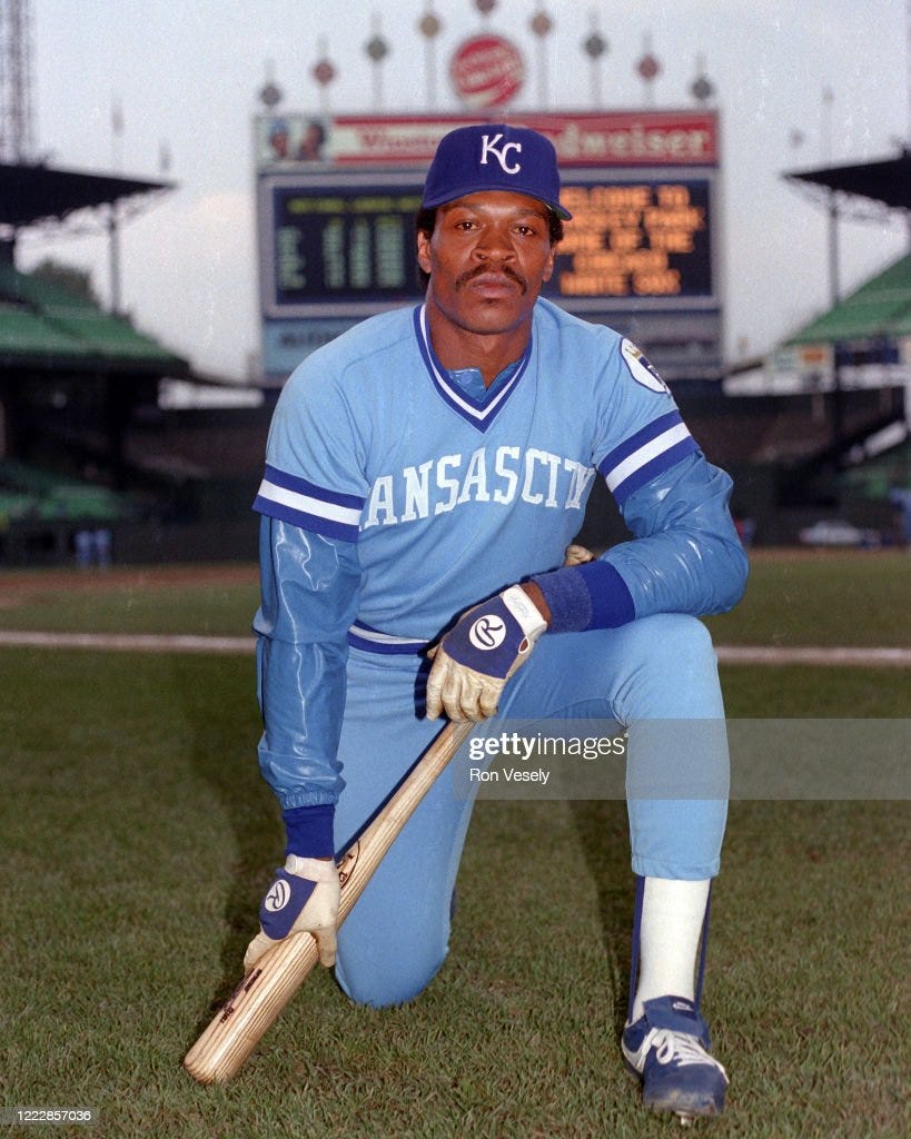
Well, we’re into double-digit posts on Powder Blue Nostalgia and no one has made me stop writing yet, so I thought we’d do something a little different this time out. Let’s rank the powder blues!
They are, after all, the inspiration behind the name of this newsletter. Personally, I identify them with a golden age of baseball, but as I’ve touched on before, I have to admit that it’s not the most accurate title for a blog that covers baseball from 1985-1994.
My perception is obviously skewed by being a Royals fan. (In more ways than one, I’m sure, but let’s stick to powder blues for now.) The Royals introduced their powder blue road uniforms in 1973 (their fifth season), six years before I was born, and along with the Expos, stuck with them longer than anyone else until 1991. In 1992, both teams gave in to the trends of the day and powder blue died a premature death.
That date falls firmly in the period we’re covering, but the truth is that most other teams had given up the ghost long before then. Powder blues were really a staple of the late 70’s and early 80’s, with the peak coming in 1981 when eleven teams wore them on the road.
So we’re going to expand our scope a little bit, just by a few years. I may not have seen all of these teams play in their powder blues live, but I’ve seen enough highlights and baseball cards that they’re burned into my brain as a symbol of the glory days. I’m going to rank them, even if it is cheating a bit. Cheating, after all, is a big part of baseball.
Just keep in mind that these rankings are completely subjective. I am no fashion maven, and I’m just telling you what I like and don’t like. You are obviously free to disagree and come up with your own rankings. Heck, send them to me. We’ll argue about it. It’ll be pointless and fun.
The only parameters I’m putting into place is that the team had to wear a powder blue uniform at some point in the 80’s. This rules out the weird satin powder blue uniforms that the Dodgers wore in 1944, and the red and powder blue uniforms the Chicago White Sox sported from 1964-1975. I’m also not including the Seattle Pilots, who existed for one season in 1969 before becoming the Milwaukee Brewers. Their uniforms shared a lot of similarities, however, and the superior Brewers will be represented.
Okay, it wouldn’t be me without a long-winded intro, so we’re not changing things up that much. But enough of that for now. Let’s get to the rankings.
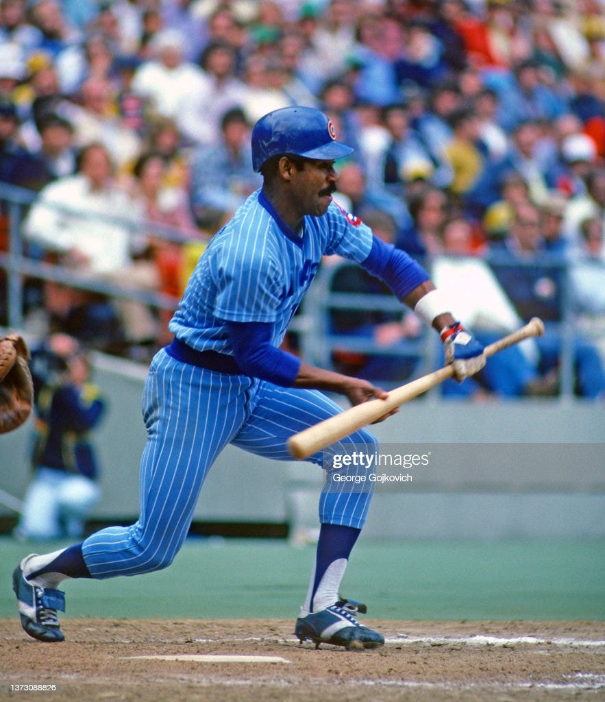
11. Chicago Cubs (1978-81)
The less said about these uniforms, the better. The Cubs were actually the first Major League team to wear powder blue, from 1941-1944, so I suppose we should thank them for introducing the practice. Unfortunately, they decided to bring them back in 1978 and really mucked it up.
I’ve seen worse uniforms, but not in powder blue. The white pinstripes and dark blue lettering just doesn’t work for me. I really want to like them on general principle, but I just can’t get there. I know there are people out there balling their fists at such a misguided take, but like I said, these are my rankings. And to me, these are proof that no concept, even powder blue, is perfect.
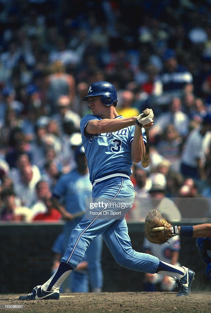
10. Atlanta Braves (1980-86)
It doesn’t help that these were the official look of the Braves during an especially terrible era in the franchise’s history. I’m not blaming the uniforms themselves. They obviously didn’t hold back Dale Murphy, who won NL MVP’s in 1982 and 1983. But the association with rampant losing does them no favors.
Not that they have a lot going for them anyway. The best I can say about these is that they were remarkably bland. Other than a basic script Atlanta across the chest and a number outlined in white, there’s not much to them.
The Braves uniforms from the seventies with the mix of red, white, and blue and the lowercase A on the hat and jersey were far superior, and the franchise has made the right call on going with that as their throwback. Thankfully, they’ve never felt the desire to pull the powder blues back out of the closet.
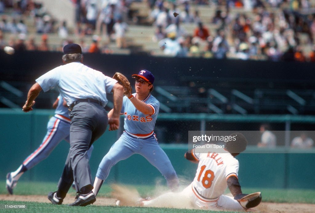
9. Texas Rangers (1975-82)
Now is where I veer into more dangerous territory. I mean, I can see why some people might like the Rangers’ powder blue look. The red, white, and blue trim and stripes were inspired by the Texas flag (not the American flag), and pretty much every native Texan I’ve ever met has a ridiculous abundance of state pride. Maybe that, in itself, was enough to win over the fanbase.
As a Kansan and non-Rangers fan, they don’t do as much for me. Plus, the weird font they used to write Texas across the chest is very off-putting. I much prefer the look of the powder blue alternate uniforms they introduced a few years back. The white script Rangers with the underline looks so much better.
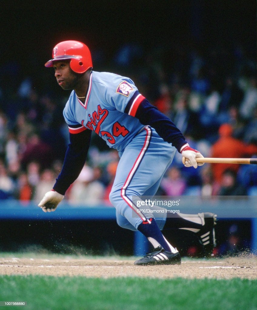
8. Minnesota Twins (1973-86)
At this point, you might be asking me— Dude, are you sure you even like powder blue? It’s a fair question. I’ve been critical of our first three uniforms. But from here on out, I’ve got nothing but positive things to say. I like each of the top eight choices. It’s just a matter of ranking who I like best.
We’ll start with the Twins. The Twins’ main colors are navy blue, scarlet red, gold, and white. These don’t immediately jump out as natural fits with powder blue, but somehow it worked. If someone brings up Kirby Puckett or Kent Hrbek, the first image that pops into my mind is them in their powder blues and red batting helmets. And yes, I’m already starting to think I underrated these. But I have to put them in some order.
Unfortunately, the Twins made the switch to road grays in 1987, just in time to surprise everyone and win the World Series. They would follow it up with another title in 1991, so the powder blues are M.I.A. in their most important highlights.

7. Seattle Mariners (1977-84)
They aren’t the first uniforms I think of when I picture the Mariners. Not surprisingly, the classic M’s look for me is the uniform that Ken Griffey Jr. wore in the 90’s. But I actually like the Seattle powder blue look, even if it comes off a bit as a poor man’s version of the Brewers.
The powder blue interacts well with the yellow trim and darker blue stripes and lettering. And how can you not like the old trident M logo? Seattle should bring that back tomorrow. Hell, just bring the whole thing back. Their modern look, which favors a mix of dark blue and teal isn’t bad, but it’s nowhere near as cool as these.
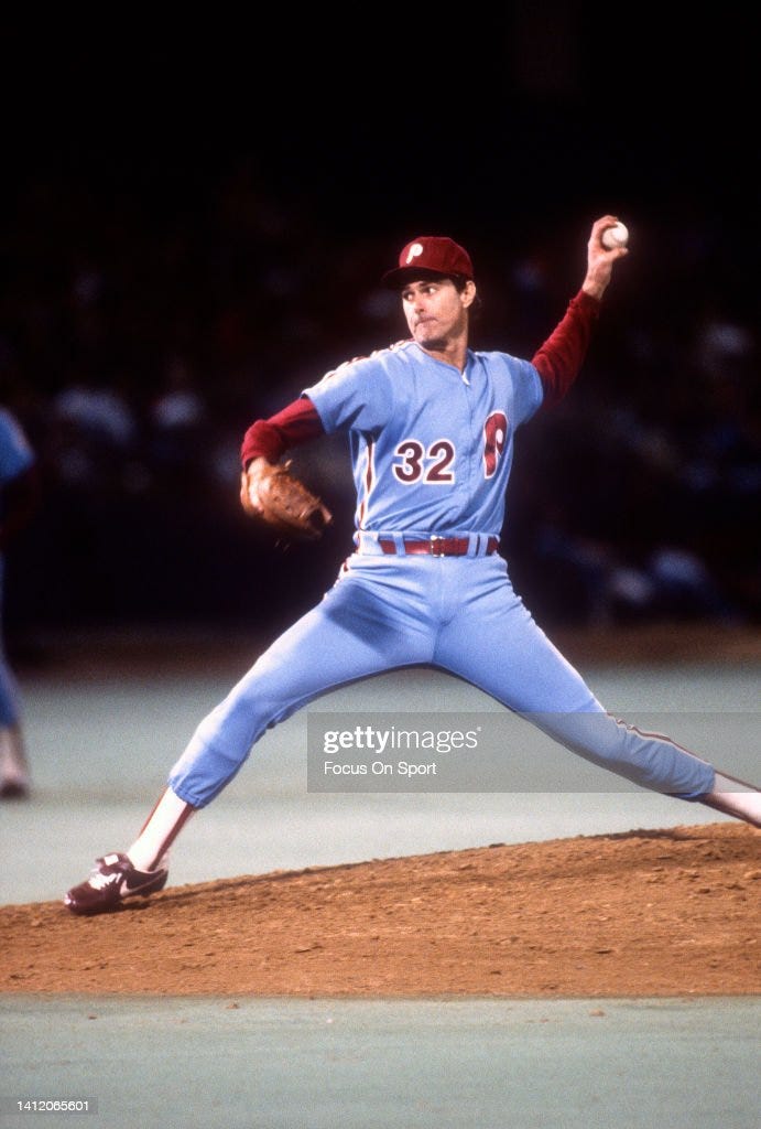
6. Philadelphia Phillies (1972-88)
I expect to get a bit of pushback on this one. How can you rank the Phillies sixth? Let me be clear, I love the old Phillies powder blues. But I love all the remaining uniforms, and I had to rank them somewhere.
The classic P logo is brilliant, and the powder blue works very well with the maroon, though maybe not as well as it does with a darker red. That’s just a minor personal preference, but these are my rankings, so that’s what we’re going with. Plus, the original Phillies powder blues had zippers instead of buttons. I don’t know if that should make any difference, but it does to me. Just a little. Not even sure I can explain why, other than I’m weird about things like that.
Fun fact: the Phillies were involved in and won the first all-powder blue World Series in 1980 against the Royals. The only other time the World Series featured two teams who both wore powder blue uniforms was 1982, when the Cardinals beat the Brewers.
5. Toronto Blue Jays (1977-89)
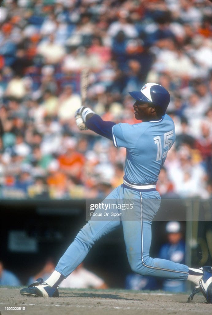
I would listen to an argument that the Phillies should be ranked ahead of the Blue Jays, but I don’t know that I’d ever be truly convinced. The Blue Jays are one of those teams that I identify most with powder blues, and it’s just a truly great look that they went with for a long time.
The Blue Jay logo is one of the best in baseball, and it practically sings in unison with the powder blue. But the real star of the show is the lettering and numbers. I’m not even sure what to call it— I describe it as a sort of stenciled look with split white letters and numbers. Whatever it’s called, it’s iconic. Plus, few uniforms have ever utilized the pullover jersey better than Toronto in the 80’s.
4. Montreal Expos (1969-91)
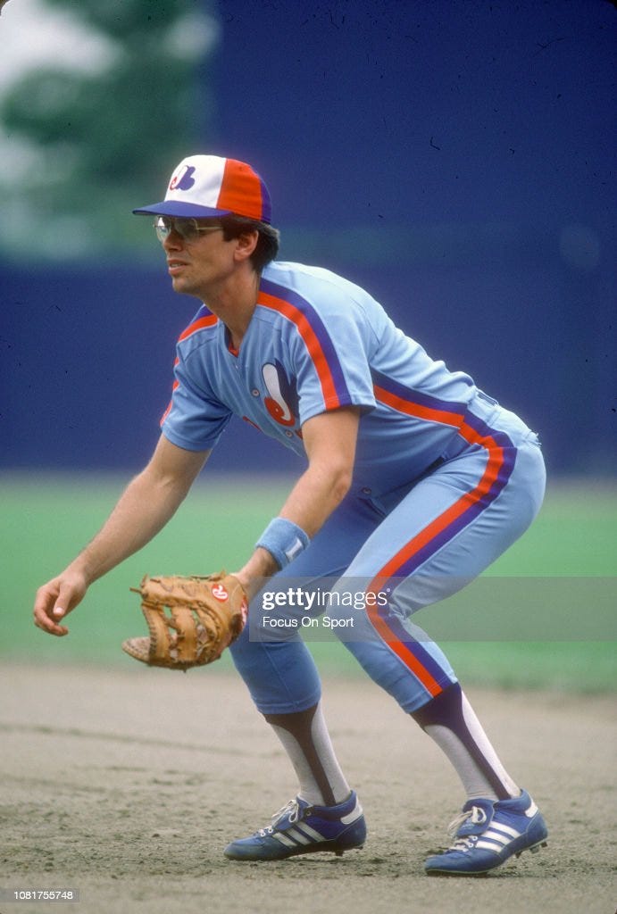
Let’s stay in Canada for our next uniform as well. I mentioned earlier that the Expos stuck with the powder blues longer than anyone else besides the Royals, and they were absolutely right to do so.
Loosely inspired by the color scheme of the NHL’s Montreal Canadiens, the dark blue and red racing stripe on the side of the uniforms formed a nice contrast with the powder blue. The real star of the show, however, might have been the hat. With the red back, blue bill, and white front adorned with the fantastic M (or e and b, depending on how you look at it) logo, few teams have ever taken the field looking as good as the Expos in their prime.
Leave it to a Canadian team to show America’s pastime how to make red, white, and blue really work on a baseball uniform. That wasn’t a direct shot at Texas, but I can feel the whole state turning against me nevertheless.
Also, I’m not saying that giving up powder blue played any role in the Expos leaving for Washington over a decade later, but it couldn’t have helped either.
3. Kansas City Royals (1973-91)
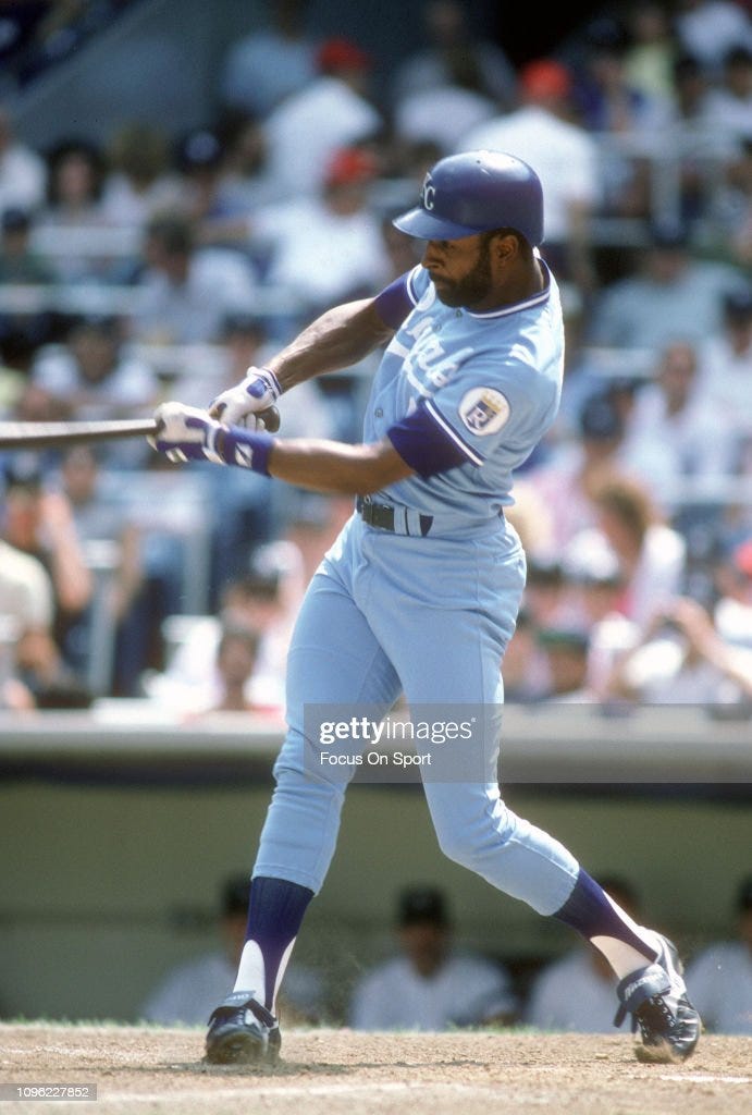
This was difficult. The Royals are easily my sentimental number one. Their powder blue uniforms represent baseball at its best to me. I see pictures of them and I’m a kid again, reliving the 1985 World Championship. Tough to beat that, but I’m trying to be objective here.
The Royals powder blue worked well with the darker blue hats and really made the white numbers and lettering pop. Like Toronto, they originally went with pullovers, before later switching to button-downs. For the first decade, Kansas City was printed across the front, but in 1983 they switched to the trademark script Royals with the swoosh underneath.
I’ll also give the Royals a few bonus points for being one of the first to bring back powder blue. In 2008, they introduced a powder blue alternate jersey, though I have to take at least one of the bonus points back because they wear them with white pants. Fans like me have been clamoring for the all powder blues ever since, and the voice of the people has finally been heard. The Royals recently announced that full powder blue uniforms will be returning on Opening Day 2023. You know, you question whether your work is really making a difference in the world, and then something like this happens…
2. St. Louis Cardinals (1975-84)
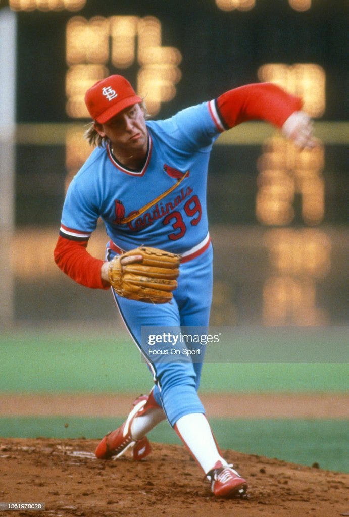
I feel like a bit of a traitor even typing that, but it can’t be denied. These uniforms are phenomenal. The dark red works beautifully with the powder blue, giving it a slightly darker look, but without robbing the blue of its coolness. (Oddly, this is the opposite of Philadelphia’s uniforms. I’m not sure why. I just call it like I see it.) Throw in the logo with the birds sitting on the bats across the chest of the pullovers, and what’s not to like?
Just seeing a mock-up of these uniforms makes me want to watch Willie McGee hit a double down the line or Vince Coleman steal a base. Keith Hernandez once said that they were his favorite uniforms that he ever wore. And if Keith Hernandez says that, well, I’m not going to argue with him. Because Keith Hernandez is awesome.
And now we come to number one.
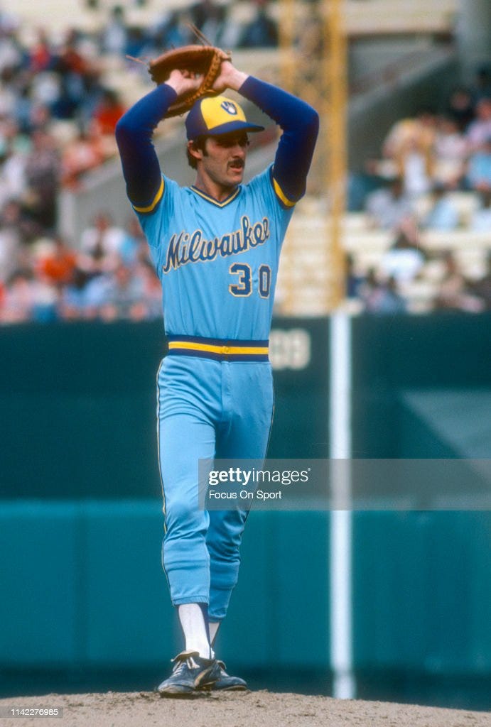
1. Milwaukee Brewers (1970-86)
It makes me sad that I really only got to see these in action for two years, and I was too young too fully appreciate it.
I totally missed out, because these things are works of art. The ball-in-glove logo is probably the best in baseball history— similar to the excellent Expos logo, it’s really two images combining to make another. The glove is formed by an m and a b, which obviously stands for Milwaukee Brewers.
Both on the hat and the uniform, the complimentary dark blue and yellow really put it over the top. Like I said, it’s very similar to the Mariners’ uniforms, at least when you break it down to its component parts, but everything comes together just a little better than Seattle’s.
Mirroring the Royals, they originally had Brewers printed across the front of their pullovers, only to later switch to a superior script Milwaukee. (They also started with a much lamer plain M logo before switching to the ball-in-glove.) So in many ways, they really incorporate elements from a lot of the other great powder blue uniforms into their own unique spin on the fashion. No wonder they’re number one.
The only thing sadder than me not getting to see these in action live was that the Brewers switched to a very generic look in the 90’s, losing the powder blue and the ball-in-glove logo in favor of a bland uniform with road grays and a stalk of wheat featured prominently across the chest.
Thankfully, those uniforms have also since been confined to the dustbin of history, and replaced with a throwback that once again features the classic ball-in-glove logo. The new look uses dark blue and an even more liberal dose of yellow instead of the classic powder blue, which is a shame, but it’s still a definite improvement on what came before.
And never fear, because even if the Brewers have yet to fully embrace the past, we are living through a powder blue renaissance. Over the last several years, numerous MLB teams, including the Cardinals, Phillies, Rangers, Twins, and Blue Jays have all brought back powder blue alternate uniforms. Even the Washington Nationals have occasionally broken out the old Expos uniforms.
Some teams, like the Rangers, have even found ways to improve the look. Others, like St. Louis, have largely remained faithful to the original uniform. The Phillies even wore theirs during the 2022 World Series. The fact that the Astros did not match their effort by breaking out their Tequila Sunrise uniforms is one of the great missed opportunities in recent baseball fashion.
But I’ll save my thoughts on the Astros’ uniforms for a later post, when I break down my favorite non-powder blue uniforms. Next time, we’ll get back to our regularly scheduled programming. If this post proves nothing else, there’s clearly a demand for it.
Baseball fans love reminiscing in powder blue.
Thanks for reading Powder Blue Nostalgia. Please share with your baseball friends and subscribe if you haven’t already. And I know these rankings are bound to inspire disagreement. Let me hear your rankings in the comments.


Dang I can hear the entire Texas state fuming at the Texas hate in this article
Brewers, Royals, Expos. Cardinals are solid enough but never really made sense.