A few months back, I ranked all the powder blue uniforms. And I stand by those rankings, for the most part, though I admit I might have undersold the Minnesota Twins a little bit. So this week I thought I’d see how the other half lives and rank my favorite non-powder blue uniforms.
Don’t worry, I’m not going to rank every non-powder blue uniform. Even I’m not that long-winded, and I would like to make this a relatively short post for PBN. So, with that in mind, I’m just going to give you my top five.
As with my powder blue rankings, the only requirement for these uniforms is they had to be worn during the PBN Era, which is what I’ve labeled my first decade of baseball, 1985-94. I’ll give myself a few years leeway prior to 1985, mainly because of baseball cards. I was an avid collector as a kid, so even if I didn’t actually see a specific uniform in action in the early 80’s, chances are I’m still extremely familiar to them thanks to my baseball card collection. It’s a little bit of a loophole, but I’m the one in charge here, so I’m going to allow it.
The only other note I’ll make is that these rankings are in no way authoritative or official. As much as I would like to consider myself the ultimate judge on all matters baseball, I’m not…yet. So if you disagree, please feel free to leave your own takes and rankings in the comments. But that’s enough preamble. Let’s get to the rankings.
Honorable Mention: New York Mets and San Francisco Giants. I won’t say too much about either, but both are simple, yet classic looks that immediately bring me back to my childhood. They’d probably be my six and seven, and I wanted to mention them, but I promised I would only do five teams. So, seriously, let’s get to the real rankings.

5. Baltimore Orioles
When I was a kid, my aunt and uncle from Oklahoma would visit a few times every year. They usually stayed at my grandparents’ house, and every time I saw their car parked in the alley it would have an Oklahoma Sooners hat and a Baltimore Orioles hat in the back window. I never saw my uncle wear a hat, and he worked for a car rental company, which meant he had a different car for every visit, but he always took the time to switch the hats out. Maybe he viewed them as some sort of good luck charm. I don’t know.
On many occasions, he told me that he’d spent a substantial part of his childhood living only a few blocks away from Memorial Stadium in Baltimore, and the Orioles were his team. I’ve never even been to Baltimore, but the hat itself was enough to win me over.
Few things are as synonymous to 80’s baseball for me than the Orioles logo of the time. The cartoon bird wearing a hat of his own is possibly my third favorite logo ever, after the Brewers’ ball-in-glove logo and Expos emblem. (There is another contender on this list, but I don’t want to get ahead of myself.) It adorned the front of the O’s hat with a clean white background. The back of the hat was black, and the bill was orange.
Black, orange, and white are a potent color combination (probably why I like the Giants’ look as well), and it carried over to their uniforms just as nicely. Fortunately, I was lucky to miss out on Baltimore’s all-orange uniforms of the 70’s (and the Indians’ all-red versions while I was at it). Powder blue can carry an entire uniform by itself, but orange and red and I’ll daresay most other colors can’t. The Orioles’ uniforms of the 80’s were much sharper, however. Players like Cal Ripken and Eddie Murray wore crisp white pants and jerseys with orange and black trim, orange lettering, and orange numbers. Orange was definitely the dominant color, but don’t undersell the power of white. It held the home uniforms together in a way the road grays didn’t.
Much to my dismay, the O’s made a major shift to their look in 1989. Black became the dominant color, which was bad enough, but the worst part was what they did to the hat. Gone was the cartoon bird, replaced by a boring realistic Oriole. So lame. It took the O’s over twenty years to smarten up, but they brought back the cartoon in the last decade and their overall look is very reminiscent of the 80’s Orioles. Hopefully, they stick with it this time, although these rankings will make it abundantly clear that teams have a hard time not tweaking their unis.
4. Houston Astros
My favorite great-aunt on my dad’s side (my grandpa’s sister) lived in Houston. Aunt Helen was one of the friendliest and most outgoing people I’ve ever met, and she could talk to anyone about anything, even to a little boy about baseball, a subject in which she had, at most, a passing interest. She was a living, breathing example of Southern hospitality, and even though she had grown up in Kansas, she even developed a bit of a Southern accent.
Her husband, Fabian, was very different. He was a bit of a salty curmudgeon with no shortage of things to complain about. I suppose this should have made him unlikable, but he wasn’t. He was actually extremely cool, even when he was griping at you to sit up straight. They visited my grandparents’ farm every year, and I always looked forward to seeing them. Fabian talked baseball with me, tossed underhand pitches to me in the driveway, and always took us fishing at my grandparents’ pond. Fishing was not an irregular thing for us, but it was always a special occasion with him around.
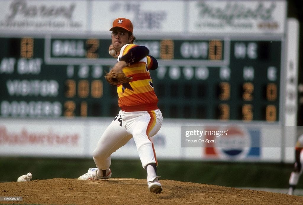
If I have a soft spot for the Astros, it’s due to them. Well, them and those tequila sunrise uniforms from the 80’s. Orange at the bottom with stripes of different shades of orange, red, and yellow up to nearly the top of the sleeves where they met a blue star over the left breast and an off-center ASTROS, the trademark Astros uniforms of the 80’s really were something else. In a golden age of uniform creativity, no one swung for the fences like the Astros.
The thing is, most people of the time felt like they swung and missed. The “tequila sunrise” jerseys were not terribly popular when they were actually in use. Even the owner’s wife wanted them to tone it down, so they introduced a new road jersey replacing the warm colors rainbow with gray. They still had the star on the chest, next to the ASTROS, with blue and orange trim, but the gaudiness was turned off.
Here’s the thing though. I loved the “tequila sunrise” uniforms. For a young kid, that mix of colors was intoxicating. Any time I got to see the Astros wear them on the game of the week, or caught a clip of Nolan Ryan or Mike Scott wearing them on This Week in Baseball, I was in uniform heaven. Side note: Helen and Fabian tried to get me an autographed Nolan Ryan baseball on several occasions at the Astrodome, but came up empty. Still, it meant a lot to me that they tried.
The “tequila sunrise” uniforms were too unique to last long, however. In 1981, the Astros introduced a home white alternate version of their toned-down road uniforms, and in 1987 they replaced the “tequila sunrise” uniforms as their primary look. I suppose I should have been upset, but I have to admit that the white version of those uniforms were pretty great too, much better than the road version. There’s white, the underrated MVP of baseball uniforms, coming up big in the clutch yet again.

The Astros have had several different looks in the years since, most of them inferior, but their current uniforms aren’t bad. And they even break out the “tequila sunrise” uniforms as an occasional alternate. Although, I’ll never forgive them for not wearing them during the 2022 World Series when the Phillies wore their powder blue throwbacks. What a missed opportunity!

3. Pittsburgh Pirates
The Pirates of the 70’s and 80’s were sort of like the Oregon Ducks of their day. They had so many different looks, and almost all of them were great. It’s difficult to pick a favorite. Here are a few examples.
Pinstripe home whites with Pirates across the chest in black with gold trim, and the number on the left side.
All gold road jerseys with a black Pirates across the chest.
Gold jerseys with black pants. (Probably my favorite one.)
They also had all black uniforms, and in 1985 introduced gray pullovers for the road. A few years before that, they dropped the pinstripes on their home whites. The Pirates obviously preferred to have options, but the thing that really made them unique was their hats.
For most of the 70’s and 80’s, the Pirates wore an old school pillbox hat, instead of the normal baseball caps that every other team wore. I suppose they were an homage to professional baseball’s earliest days, but whatever the case, they set the Pirates apart. Generally black with a gold P on the front (although they occasionally switched the color scheme around), the unusual shape gave the Bucs a distinctive look no matter what uniform variation they were sporting on a given night. They were also often adorned with Stargell Stars (named in honor of Pirate legend Willie Stargell), which were awarded any time a player made a great play, sort of like college football teams do with helmet stickers.
I had a distant cousin we rarely saw when I was a kid. He was quite a bit older than me, away at college most of the time, but whenever we had a family gathering at his house, I was enthralled by the pill box Pirates hat he had in his room. I wanted it so bad, but I had to settle for wearing it around while we were visiting. In 1987, the Pirates dropped the pill box hats for a more conventional style. They’re still pretty cool hats, but it’s just not the same.
2. Chicago White Sox
I don’t have a ton of personal connections with the White Sox, but I loved watching the Royals play at Comiskey when I was a kid. I’ve written about this before, but it had such a distinctive look on TV with its bright yellow railings in the background, and the fact that Carlton Fisk was one of my mom’s favorite players meant that we rarely missed a Royals game on the South Side.
Now, the White Sox have made some of the most questionable uniform choices in baseball history. This is the team that wore shorts and jerseys with big floppy collars in 1976, after all. But the uniforms they wore from 1982-86 were some of the best, even if I didn’t quite realize it at the time.
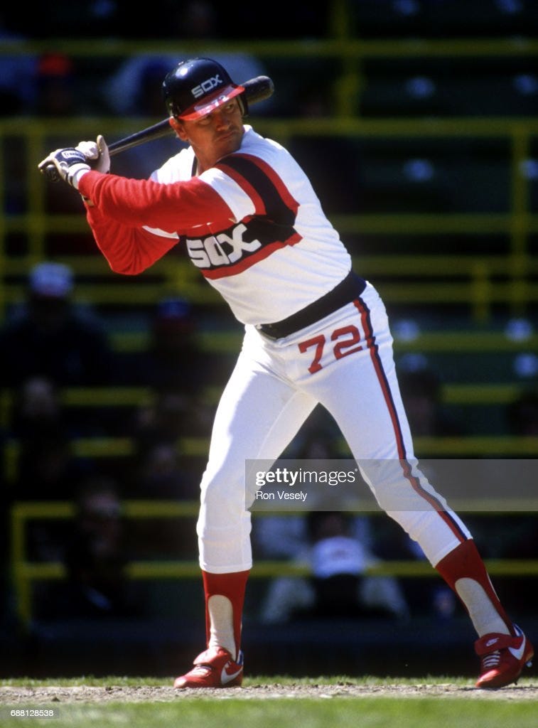
The Sox used a red, white, and blue color scheme (gray replaced white on the road), and as with some of our earlier examples, the crisp white against the more vibrant colors really put them over the top. Two thin red stripes sandwiched a thick blue strip that went across the jersey and sleeves, with a large white SOX written in block lettering inside the blue strip. They also included a blue waistband, red stirrups, and the real kicker was the red numbers on the hip. I don’t know why, but that was really cool.
The hat had a white front with a blue SOX across it, a blue back, and a red bill. They also employed their “batterman” logo, often incorporated above the block SOX. A simple, blocky silhouette of a batter holding a bat, it is the other great logo of baseball history that I teased earlier, and it immediately brings me back to my childhood.
Of course, I didn’t fully appreciate this look in the moment. The White Sox changed their look in 1987, and again in 1991, to the solid look that has largely stayed in place through the present, and no tears were shed by me on either occasion. Maybe it’s nostalgia, or my taste has simply improved over time, but the old “batterman” look has grown on me over the years. Fortunately, the White Sox put a throwback version of them into rotation in 2014, wearing them for Sunday home games. You see, not every good thing goes away forever.
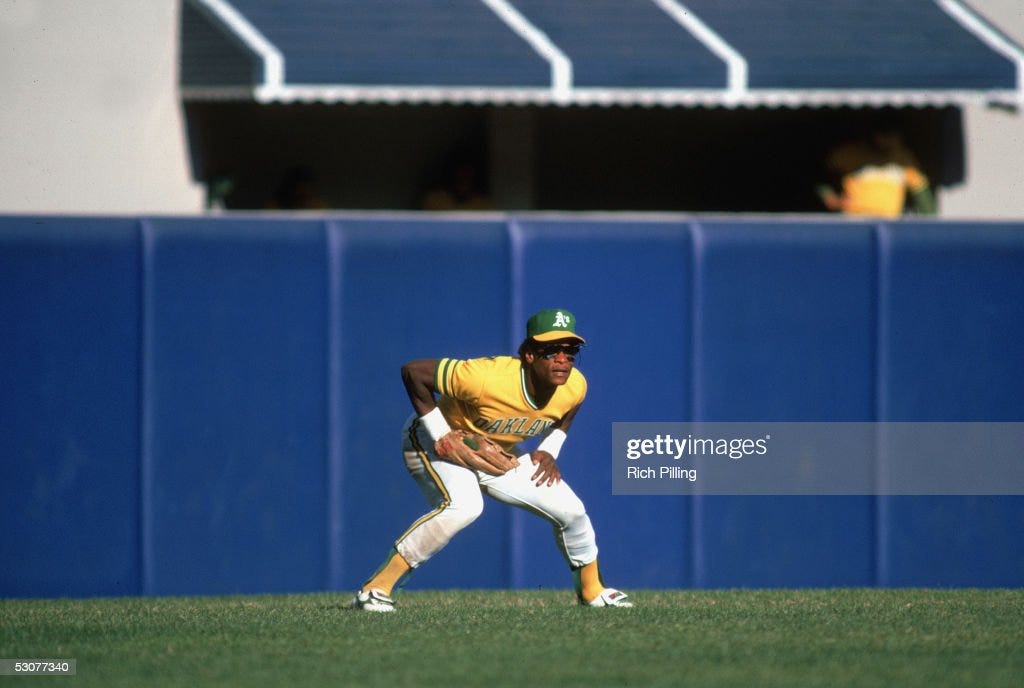
1. Oakland Athletics
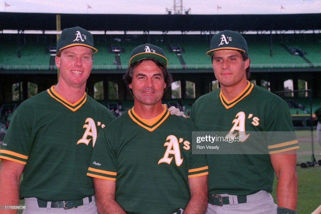
There was never any doubt that the A’s would be at the top of this list. Certainly, the fact that they were my backup team in the late 80’s and early 90’s doesn’t hurt their cause, but it’s more than that. The A’s are the true nomads of MLB, having begun in Philadelphia and moved to Kansas City, then Oakland, and now it appears that they will be on the move again to Las Vegas in the near future. Their look has probably changed even more than their location over the years, but yet there is always something truly classic about it.
I think it has to do with their green and gold colors. (The A’s colors are generally referred to as green and gold, though I think they’re actually green and yellow. When I hear gold, I think of Notre Dame’s football helmets, and that definitely ain’t the shade the A’s use.) Those haven’t always been the A’s colors. They’ve also used red and blue, but sometime during their stay in Kansas City, they settled on green and gold and haven’t looked back since.
The A’s hat is a true work of art, and proof that beauty doesn’t have to be complicated. The bulk of it is kelly green with a white A’s embroidered across the front, and a bright yellow bill. It almost sounds like it should be nearly as gaudy as the old Astros uniforms, but it manages to be classy and slightly understated instead. I wore one for a good portion of my childhood, and while every other part of me might have screamed dork, I never had to worry about my hat.
Like the Pirates, the A’s were never content with one uniform combination and were constantly adding more tweaks into the occasion. They had white pullovers with green lettering and gold trim, and OAKLAND scrawled across the chest in the early 80’s. The road pullovers were green with white lettering and numbers. There was also a gold pullover with green letters and a big A’s on the chest. Then they reversed them with green pullovers and gold lettering. Both of those were very cool.
By the late 80’s, the pullovers had mostly been relegated to batting practice. The game jerseys changed to button-downs and took on a more conservative look that was still very effective. Again, white played an underrated role in bringing it all together. The home version had a green script Athletics with a swoosh under it across the chest, and a number on the lower left side, also in green. All the green lettering was outlined with gold trim. Perhaps most impressively, the road uniforms, which were gray, were one of the few gray uniforms to work as well as the home white version. Something about the way the gray interacted with the green and gold unlocked the former’s usually dormant potential. It was just a really clean and impressive look.
And, of course, there was an elephant patch on the sleeve. The A’s association with the elephant logo always puzzled me as a kid, but it dates back to the team’s time in Philadelphia. New York Giants manager, John McGraw, once said “the Philadelphia club will make no money. They have a big white elephant on their hands.” A’s owner, Connie Mack, was amused by the boast, so he incorporated the elephant into the A’s look and used it as a rallying cry.
Later owner, Charlie Finley, changed the team’s mascot to a mule after the A’s moved to Kansas City in 1955. Never above pandering to his audience in his efforts to make a buck, Finley recognized that Kansas City was a democratic stronghold at the time, so he adjusted accordingly. The mule is also Missouri’s state animal apparently. Finley even bought a real mule to parade as a mascot at Municipal Stadium.
I’m pretty sure Oakland leans Democratic as well, but while the mule has not been completely forgotten, the elephant has seen a second coming in California. Not only was the elephant incorporated into the uniform for the first time in the late 80’s, but the A’s also have an elephant mascot named Stomper. This is a person in an elephant costume. Unlike Charlie Finley, the later owners have never committed to acquiring a real animal. That would probably cost too much money. I wonder what animal they’ll latch onto in Vegas. One thing’s for sure though, regardless of what their mascot might be, for better or worse, the A’s uniforms will probably look great. They always do.
Thanks for reading Powder Blue Nostalgia. I’m sure everyone is in agreement with my rankings and has nothing to add. But just in case I’m wrong, feel free to leave your take on my rankings in the comments below. Or better yet, share your own rankings! You can stick with the PBN Era (1985-94) or share your favorite uniforms from whatever time period you consider your golden age.


Love that you put the Astros on there. I was always a fan of those uniforms when I was growing up. Oakland at #1 is cool. I think I would have went 1. Houston. 2. Chicago WS. 3. Pittsburgh 4. Oakland 5. San Diego with the Cubs a close 6th.
As a White Sox fan, I am glad you gave the block letter SOX jerseys some love! I also love those A's uniforms, a throwback Rickey Henderson jersey is a purchase I will someday make!